I remember sitting in a cramped startup office at 9 PM, staring at three different spreadsheets that refused to talk to each other, while our “all-in-one” erp software sat idle because it was too bloated to actually use. It was the ultimate irony: we had bought the most expensive solution on the market, yet I was still manually copying data from one window to another just to keep the logistics from collapsing. Most companies fall into this trap, thinking that more features automatically equals more productivity, when in reality, they’re just buying expensive digital noise that complicates every single workflow.
I’m not here to sell you on a shiny demo or a list of enterprise-grade buzzwords that mean nothing in the real world. My goal is to cut through the marketing fluff and show you how to identify erp software that actually handles the grunt work without requiring a PhD to operate. I’ll be sharing my data-driven take on which systems actually save you time and which ones are just expensive distractions masquerading as progress. Let’s find a setup that actually works so you can stop fighting your tools and start doing your job.
Table of Contents
Why Modular Erp Architecture Beats Bloated Feature Sets
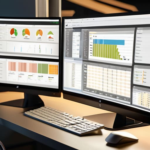
Most companies make the mistake of buying a massive, all-in-one suite thinking more features equals more power. In reality, you’re just paying for a mountain of buttons you’ll never click and a UI that feels like a cockpit from the 90s. This is where modular erp architecture changes the game. Instead of forcing your entire team to learn a monolithic system that does twenty things mediocrely, you pick the specific modules you actually need—like inventory or finance—and build outward. It keeps your workspace clean and prevents that “analysis paralysis” that kills productivity.
When you go modular, the erp implementation process becomes a series of quick wins rather than a multi-year nightmare that breaks your existing workflows. You can start with one core function and integrate other tools as you scale. This approach allows for much smoother enterprise software automation because you aren’t fighting against legacy code or unnecessary layers of complexity. You’re building a lean, mean machine that actually supports your operations instead of becoming another chore you have to manage every single morning.
Real Time Data Management Without the Mental Clutter

The biggest mistake I see during an erp implementation process is companies trying to centralize everything at once without a clear data strategy. You end up with a “single source of truth” that is actually just a single source of chaos. Real-time data management shouldn’t mean you’re staring at a dashboard of flashing red lights all day; it should mean that when a shipment moves in your warehouse, your inventory levels update instantly without you having to click a single button.
If you’re still manually reconciling spreadsheets against your system, you aren’t actually managing data—you’re just babysitting it. I’m a huge advocate for enterprise software automation because it removes that layer of “did this actually sync?” anxiety. You want a system where the data flows silently in the background. The goal is to reach a state where the information is just there when you need to make a decision, rather than forcing you to hunt through menus to find out what happened ten minutes ago. Stop chasing updates and start trusting your stack.
5 ways to stop letting your ERP become a digital paperweight
- Audit your actual workflows before you buy. Don’t let a sales rep talk you into a “complete suite” if your team only needs inventory and basic accounting; buying features you won’t use is just paying to add more noise to your dashboard.
- Prioritize API flexibility over “all-in-one” promises. A closed system is a trap. You need an ERP that plays nice with the tools you already love—like your Slack or your specific logistics stack—rather than forcing you to migrate everything into one clunky ecosystem.
- Demand a clean UI or don’t bother. If your team needs a 50-page manual just to log a single shipment, the software has failed. If the interface is cluttered and unintuitive, people will find workarounds, and your data integrity will tank.
- Test the mobile experience for the people in the field. If your warehouse or logistics crew can’t update status updates on a phone without fighting a desktop-style layout, you’re just creating a data bottleneck that will haunt your reports later.
- Focus on automated data entry, not just storage. An ERP shouldn’t just be a place where data goes to die; it should be actively pulling information from your hardware or sensors so your team isn’t wasting mental energy on manual entry.
The bottom line: Stop paying for noise
Prioritize modularity over “all-in-one” promises; if you don’t need a specific module to run your daily operations, don’t let it clutter your interface or your budget.
Real-time data is useless if it’s overwhelming; look for systems that filter the signal from the noise so you’re making decisions based on facts, not a wall of flashing notifications.
A tool is only as good as the time it saves you; if the implementation process or the UI feels like a second job, it’s not a solution, it’s just more technical debt.
The efficiency trap
Most companies don’t need more features; they need fewer distractions. An ERP shouldn’t be a digital junk drawer of buttons you never click—it should be the silent engine that handles the grunt work so you can actually focus on the job you were hired to do.
Mateo Salcedo
Cutting through the noise

At the end of the day, picking an ERP isn’t about finding the one with the longest feature list or the flashiest UI. It’s about finding the system that disappears into your workflow. We’ve talked about why you need to ditch the bloated, monolithic setups in favor of modular architecture and why real-time data is useless if it just creates more digital clutter. If your software forces you to spend more time managing the tool than actually running your business, it’s not an asset—it’s a liability. Focus on streamlined integration and tools that actually talk to each other without requiring a PhD to configure.
Stop chasing the “perfect” all-in-one solution that promises to solve every problem you haven’t even had yet. Most of that is just marketing noise designed to drain your budget. Instead, build a stack that serves your actual needs and scales only when it makes sense. Your goal shouldn’t be to own the most powerful software on the market; it should be to reclaim your mental energy so you can focus on high-level strategy instead of troubleshooting broken data entries. Build a system that works for you, not the other way around.
Frequently Asked Questions
How do I actually transition to a new ERP without my entire operation grinding to a halt for a week?
The biggest mistake I see is the “big bang” approach—trying to flip the switch on everything at once. That’s how operations die. Instead, run a parallel pilot. Pick one low-stakes department or a single workflow and move it to the new system while the rest of the team stays on the old one. You iron out the kinks in a controlled environment so that when you finally scale, you aren’t troubleshooting live fires.
Is it worth paying for a massive all-in-one suite, or should I just stick to a modular setup with specialized tools?
Look, if you’re a massive enterprise with thousands of employees, an all-in-one suite makes sense for the sheer scale. But for most of us? I’d bet on the modular setup every time. All-in-one suites are usually “jack of all trades, master of none”—they’re bloated, hard to customize, and force you into workflows that don’t fit. I’d rather pick specialized tools that actually solve specific problems and connect them via API. Don’t pay for features you’ll never touch.
How much of my time is going to be sucked up by training my team versus actually seeing a return on the investment?
Look, if you buy a system that requires a three-week seminar just to find the “save” button, you’ve already lost. I’ve seen teams spend months fighting software instead of using it. The goal is to pick something with intuitive UI—tools that feel like the apps you already use daily. If the implementation is smooth, you’ll see ROI in weeks, not quarters. Don’t pay for a tool that turns your staff into full-time software technicians.