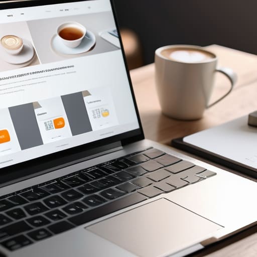
Stop wasting your budget on flashy, high-production email templates that look like digital scrapbooks. I see it all the time in my testing: companies spending weeks obsessing over complex animations and heavy graphics, only to realize their email marketing design is actually killing their conversion rates. Most of these “premium” layouts are just noise that slows down load times and distracts from the one thing that actually matters—your call to action. If your subscriber has to squint through a cluttered mess just to find the “Buy Now” button, you’ve already lost them.
I’m not here to sell you on some expensive design suite or tell you that you need a creative agency to see results. My goal is to strip away the fluff and show you how to build clean, functional layouts that respect your user’s time and mental energy. I’ll be sharing the exact frameworks I use to keep things minimalist and data-driven, focusing on what actually moves the needle. We’re going to focus on workflows that work, ensuring your emails are readable, fast, and—most importantly—effective.
Table of Contents
- Mobile First Email Design Stop Making People Struggle
- Visual Hierarchy in Newsletters That Saves Mental Energy
- 5 Design Rules to Stop Wasting Your Subscribers' Time
- The Bottom Line: Less Noise, More Results
- ## Design for Utility, Not Just Aesthetics
- Cut the Noise and Just Send It
- Frequently Asked Questions
Mobile First Email Design Stop Making People Struggle
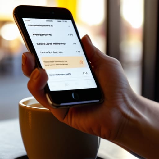
Most people check their inbox while they’re walking to a meeting or waiting for coffee. If your email looks like a cluttered desktop mess on a smartphone, they aren’t going to squint to figure it out—they’re just going to hit delete. I’ve seen too many brands build these massive, beautiful desktop layouts that completely fall apart on a five-inch screen. You need to embrace mobile-first email design from the jump. This means stacking your content vertically and ensuring your text is large enough to read without zooming.
One of the biggest mistakes I see is burying the lead in a tiny, unclickable link. If you want results, your call to action button design needs to be thumb-friendly. I’m talking about big, high-contrast buttons that don’t require surgical precision to tap. Don’t make your users hunt for the “Buy Now” or “Read More” link. Keep the visual hierarchy simple: one clear headline, a punchy image, and a button that’s impossible to miss. If they have to struggle to interact with you, you’ve already lost the sale.
Visual Hierarchy in Newsletters That Saves Mental Energy
Most people approach newsletter design like they’re decorating a room, but you should be treating it like a map. If your reader has to hunt for the point of your message, you’ve already lost them. Effective visual hierarchy in newsletters isn’t about making things look “pretty”—it’s about guiding the eye so they don’t have to think. I always tell people to use size and weight to dictate the flow. Your headline should hit them first, followed by a brief bit of context, and then a clear path forward.
Stop using five different fonts and a dozen colors just because you can. That’s just visual noise. Instead, lean into email typography best practices by sticking to one or two clean typefaces and using scale to create contrast. If everything is bold, nothing is bold. You want a clear, logical descent from the most important information down to your call to action button design. When the hierarchy is solid, the reader absorbs your value proposition subconsciously, which is the ultimate goal of any high-performing workflow.
5 Design Rules to Stop Wasting Your Subscribers' Time
- Kill the clutter. If a design element doesn’t serve a direct purpose or drive a click, delete it. Every extra icon or unnecessary border is just more cognitive load for your reader.
- Use high-contrast CTA buttons. Don’t bury your main goal in a sea of pastel colors. Your “Buy Now” or “Read More” button should be the most obvious thing on the screen, no questions asked.
- Stick to a limited color palette. I see too many emails trying to be a rainbow. Pick two or three brand colors and stay in your lane; it makes the whole thing look professional instead of chaotic.
- Optimize your typography for readability. Stop using tiny, thin fonts that disappear on a smartphone screen. Use decent sizing and enough line spacing so people can actually skim your content without squinting.
- Use white space as a tool, not a void. Don’t be afraid of empty space. It’s what guides the eye from one point to the next and prevents your message from feeling like a wall of text.
The Bottom Line: Less Noise, More Results
Stop trying to win design awards; if your email takes more than two seconds to scan on a phone, you’ve already lost the reader.
Use hierarchy to do the heavy lifting for your audience—guide their eyes directly to the action so they don’t have to hunt for it.
Strip away the fluff and the complex layouts; a clean, functional design that respects the user’s time will always outperform a cluttered one.
## Design for Utility, Not Just Aesthetics
“If your email looks like a piece of high-end digital art but takes more than three seconds for a user to figure out where to click, you haven’t designed a marketing tool—you’ve designed a distraction. Good design isn’t about how much you can add; it’s about how much friction you can remove from the user’s path to the goal.”
Mateo Salcedo
Cut the Noise and Just Send It
Look, we’ve covered a lot, but it really boils down to one thing: respect your subscriber’s time. If you aren’t designing for mobile first, you’re essentially sending your emails straight to the trash. If your visual hierarchy is a mess, you’re forcing people to do unnecessary cognitive labor just to figure out what you’re selling. My takeaway is simple—stop trying to win design awards and start focusing on functional clarity. Use clean layouts, prioritize your most important call-to-action, and ensure that the path from “open” to “click” is as frictionless as possible. Simplicity isn’t a lack of effort; it’s the ultimate optimization.
At the end of the day, your email design shouldn’t be the star of the show—your message should be. Don’t get caught in a loop of tweaking hex codes or hunting for the perfect high-res hero image while your actual strategy gathers dust. The best workflow is the one that gets your value in front of people without getting in its own way. Stop overthinking the aesthetics and start building systems that convert. Get your templates dialed in, keep them lean, and just get the work out the door. That’s how you actually scale.
Frequently Asked Questions
How do I balance using high-quality images without making the file size so huge that it triggers spam filters or slow loading times?
Look, I get the urge to use massive, high-res hero images, but if your email takes five seconds to load, your subscriber is already gone. It’s a losing battle. Run everything through a compressor like TinyPNG or use WebP formats before you even think about uploading. My rule of thumb? Aim for a balance where the image looks crisp on a retina display but stays under 200KB. Don’t let a pretty picture kill your deliverability.
Is it actually worth spending time on custom fonts, or should I just stick to web-safe basics to ensure my layout doesn't break?
Stick to the web-safe basics for your body text. I’ve seen too many “aesthetic” layouts fall apart because a custom font failed to load, leaving the reader with a messy wall of default serif text. It’s a massive friction point. If you really want that brand feel, use a custom font for your headers only, but keep the heavy lifting to fonts that are guaranteed to render. Don’t sacrifice usability for a vibe.
How much "white space" is too much before a design starts looking unfinished or unprofessional?
Look, white space isn’t “empty” space; it’s breathing room for the eyes. You know you’ve gone too far when the user starts questioning if the content failed to load or if you just forgot to finish the layout. If your call-to-action is floating in a massive void of nothingness, you’ve lost the momentum. Use enough space to separate ideas, but keep the elements close enough to feel like a cohesive unit. Don’t let “minimalism” become an excuse for a lack of substance.
